I’m obsessed with thinking in maps: discovering and creating connections between ideas, adding nodes to a knowledge graph, finding patterns across distant areas of knowledge. However, the traditional way of exploring connections between research papers is fairly tedious: read the paper, scan the references, search for any relevant title, rinse and repeat. Connected Papers aims to shake things up.
Connected Papers is a tool for thought to help researchers and applied scientists find and explore papers relevant to their field of work in a visual way. You enter an origin paper, and they generate a graph. To achieve this, they analyse about 50,000 research papers, and select the ones with the strongest connections to the origin paper.
Created by Alex Tarnavsky, Eitan Eddie Smolyansky, and Itay Knaan Harpaz from Israel, Connected Papers started as a weekend side project. But when the three friends realised how useful it was in their own research, and how their friends and colleagues kept on asking to use it, they decided to release the tool for the public.
Some of the benefits of Connected Papers include:
- Getting a visual overview of a field of research. You will be able to see at a glance which papers are most popular in the field, as well as the various dynamics between areas of studies.
- Making sure you haven’t missed a key paper. This is especially useful in fields that constantly produce a large volume of new papers.
- Exploring relevant papers in a bi-directional manner. Connected Papers lets you discover the most important prior and derivative work in your area of interest.
The tool is currently completely free, and the three co-founders keep on adding new features to make it even more useful. If you want to give it a try, follow these instructions.
1. Enter an origin paper
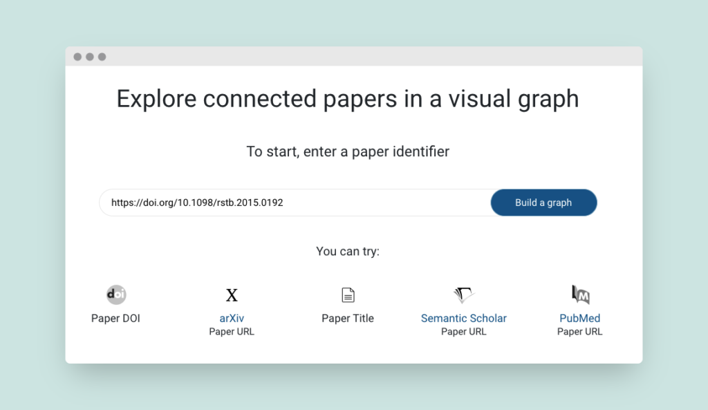
On the home page, enter one of the options to identify your origin paper. You can use a DOI, the paper’s title, or the paper’s URL from arXiv, PubMed, or Semantic Scholar. Then click on “Build a graph. For this tutorial, I used this paper, which can read more about here.
2. Read the graph
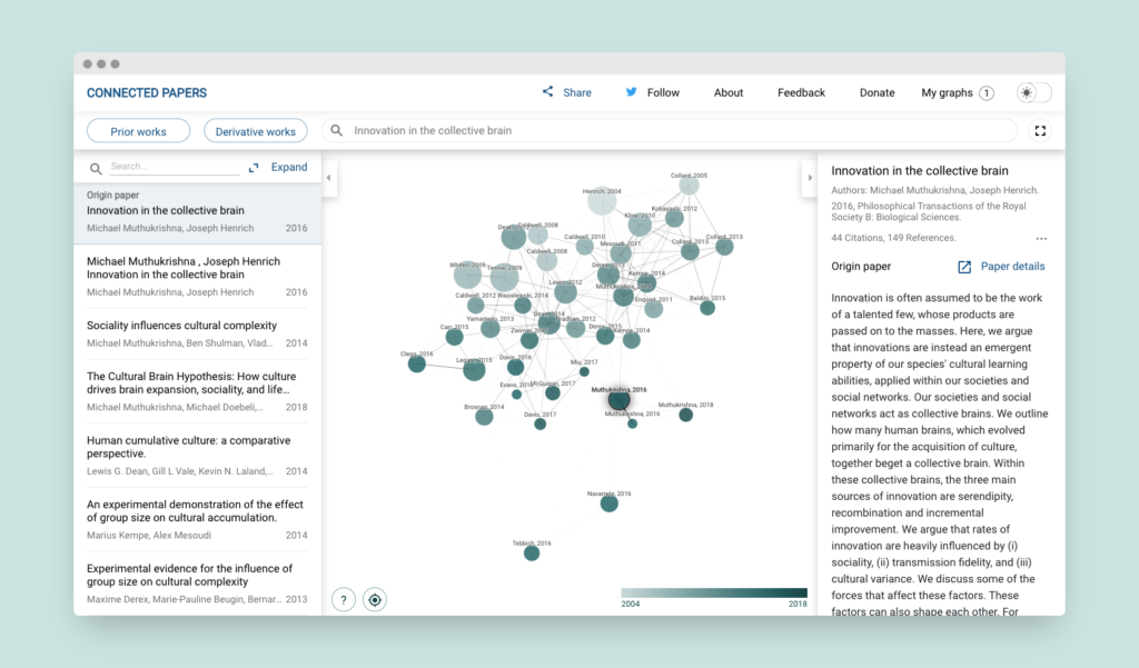
On the next page, you will be greeted by three panels. We’ll discuss the other panels later, but for now, let’s focus on the graph. Each node is a research paper related to the origin paper. Rather than a basic citation tree, the papers are arranged according to their similarity.
The size of a node represents the number of citations. The color of a node represents the publishing year—lighter is older. You will notice that highly similar papers have stronger connecting lines and tend to cluster together.
3. Explore the graph
You can scroll through papers in the left panel. Whenever you click on a paper there, it will be highlighted on the graph. You can also navigate the graph by clicking on specific nodes. Both options will update the right-side panel with more information about the selected paper.
Two buttons in the top left corner allow you to explore papers that are not included in the graph, but probably relevant to your topic of choice.
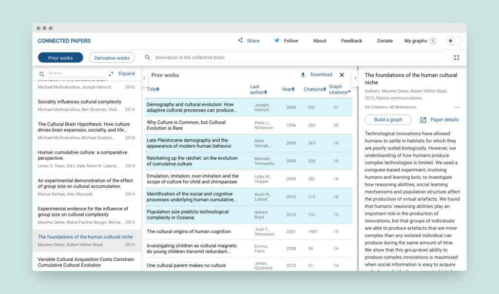
- Prior works. These are research papers that were most commonly cited by the papers included in the graph. It usually means that they are important seminal works for this field. Selecting a prior work will highlight all graph papers referencing it in the left-side panel, and selecting a graph paper will highlight all referenced prior work.
- Derivative works. These are research papers that cited many of the graph papers. It probably means they are either recent relevant works or surveys of the field. Similar to prior works, “selecting a derivative work will highlight all graph papers cited by it, and selecting a graph paper will highlight all derivative works citing it.”
If you find a paper particularly promising, you can click on “paper details” to open the link to the paper in a new window, or on “build a graph” to create a new graph based on this origin paper. Building the new graph can sometimes take a few seconds, but there will be a progress bar so you know how long to wait.
All of your graphs can be found in the top right corner of the tool, under “my graphs”.
Connected Papers is incredibly well designed, easy to use, and most importantly very helpful in exploring research paths of influence. I highly recommend giving it a try to build your mental atlas.
Update: Connected Papers is now supported on mobile browsers!